Blog·July 2026
Why Your Word Document Looks Wrong in Another App
Six ways a .docx gets quietly damaged. I have caused all of them.
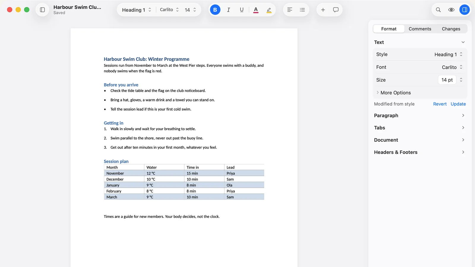
You open a Word file in something that is not Word. It looks fine. You edit a paragraph, save, send it on, and somebody tells you the header is missing.
This is extremely common and it is not usually carelessness. There is a specific structural reason it keeps happening, and I know it well, because I have shipped every single fault below in my own app and had to go and fix it.
The Underlying Trap
Almost every writing app that opens .docx does the same three things. It reads the file into an internal model. It converts that model into whatever the screen needs. Then, when you save, it converts back.
The problem is that last step runs through the display version. So anything the app does purely to make the document look right on screen becomes real, saved content unless there is an exact inverse for it.
Which means the bug is never “we forgot to save the header”. It is always something smaller and more interesting.
1. The Header That Vanishes
A Word document can have up to three different headers: one for the first page, one for left-hand pages, one for the rest. Title pages use the first-page one. So does Scrivener when it compiles, which is how a lot of manuscripts end up with a logo or a title block on page one only.
If an importer reads the header relationships without checking which type each one is, it will pick one, arbitrarily, and treat it as the only header. There is a separate flag in the file saying “this document has a distinct first page”, and if the importer does not read that either, the first-page header has nowhere to go even when it has been read.
Result: your letterhead is gone, and the file still contains it. Two independent oversights, one missing logo.
2. Page Breaks That Multiply
This one is my favourite, in the way a scar is your favourite.
A page break in .docx is a property on a paragraph: start this one on a new page. A lot of editors, mine included, represent that on screen as an invisible control character, because that is what the underlying macOS text system understands.
Encode it on the way in, and forget to decode it on the way out, and the character survives into the saved file as well as the paragraph property. Open and save again and you have two. Then four. A colleague opens your document a month later and finds blank pages breeding through the middle of chapter three.
Nobody notices this in testing, because you have to save the same file repeatedly to see it. Users notice it immediately, because that is exactly what they do.
3. Spacing That Creeps
Some documents set paragraph spacing to exactly zero. Legal templates do it. Academic style sheets do it.
Zero spacing looks cramped on screen, so it is tempting to apply a small cosmetic minimum, six points say, purely for display. That is a defensible choice right up to the moment it gets written back to the file. Now the author’s deliberate zero has become six points in their actual document, and it will be six points for everyone they send it to.
The rule I follow now: anything painted for the screen alone either lives outside the document model entirely, or has a registered inverse that strips it on save. There is no third option, and there is a test that fails if anyone forgets.
4. Numerals That Change Shape
This is the subtle one, and it taught me the most.
Oldstyle numerals are the ones that rise and fall like lowercase letters instead of standing at capital height. Typographers care about them a great deal. They are an OpenType feature, switched on per run of text.
Here is what I got wrong. I assumed a font family had these features. It does not. Individual faces do. Didot on macOS offers oldstyle figures in the roman and simply does not have them in the italic or the bold. So a document that uses them in body text and then italicises a phrase will show the numerals changing shape mid-sentence, and no app can prevent that, because the italic face cannot do it.
I spent a while convinced this was a bug in my font handling. It was not. What was my fault was offering a typography control that silently did nothing when the current face could not honour it, which made a font limitation look like broken software.
The genuine fidelity issue nearby: these features do survive .docx, through a Word 2010 extension most converters ignore entirely. If your app drops them, small caps and oldstyle figures quietly revert every time you save.
5. Measurements That Reset to a Default
A .docx stores the distance from the top of the page to the header, separately from the page margins.
It is easy to read that value correctly, hold it in memory, and then build the saved file from a fresh set of section properties where only page size and the four margins get filled in. Every other field silently reverts to its default. The author’s 72 point header distance comes back as 36, their header sits half an inch further up the page than they set it, and nothing anywhere reports an error.
Data loss with no error message is the worst category, because the only person who can detect it is the author, and only if they happen to look.
6. The Format That Only You Cannot Read
Not .docx, this one, but too good an example to leave out.
RTF supports headers and footers. macOS ships a component that reads RTF, and that component quietly discards them. If you use it without checking, your app will write headers into RTF perfectly correctly, and then be the only application on earth that cannot read its own output. Word opens the file and shows the header. You open it and it is gone.
The text was in the file the whole time.
How to Test Any App for This
You do not need to take anyone’s word, including mine. Five minutes with a real document will tell you more than any feature list.
Take one of your genuinely complicated files. Not a test document. A real one, with a header, a footnote, a page break, a table and a tracked change if you have one.
- Open it in the app. Look at it. Nothing surprising yet, probably.
- Change one word. Save. Close.
- Open it again. Save again. Close again.
- Now open it in Word, or whatever your colleagues use.
Then check, in this order: is the header still there, and on the right pages? Are the page breaks in the same places, and are there the same number of them? Has paragraph spacing shifted anywhere? Are footnotes still attached to the right words?
The second save is the important part. One round trip hides an enormous amount. Faults that compound only show up on the second or third, which is precisely why they escape into releases and precisely when real users hit them.
Why I Am Telling You This
Because it would be daft to claim Verso has never done any of it. Every fault above came out of my own bug register, and each one reached at least one real person’s document before I found it.
What changed is the checking. Every fixture I have now gets opened, saved, opened and saved again automatically, and the second save has to match the first exactly. Break counts have to be conserved. Spacing has to be conserved. If a display convention has no inverse, a test fails before the release exists. That tripwire caught two faults nobody had reported the first time I ran it.
None of which makes Verso perfect. It makes this particular category of damage something that gets caught by machinery rather than by you, a month later, when your editor asks where the header went.
If you want to try it on your own difficult documents, Verso is on the Mac App Store for $14.99, once, with a free trial. And if you find one of these, please send me the file. That is how the tests get written.
Related reading
What happens when you report a bug covers what I do with the file you send. Verso vs Microsoft Word is the wider comparison, and how to open .docx files without Word covers the free options.